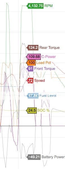
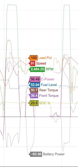
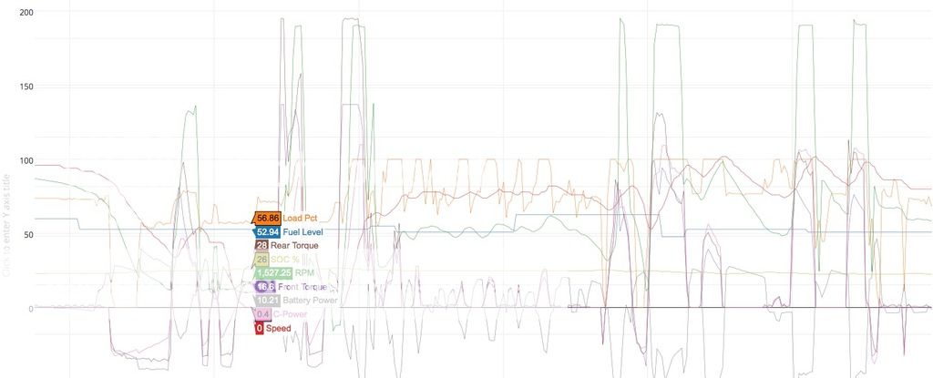
I must just be getting old, but am finding we can be overwhelmed with the spaghetti lines with many graphs combined with pastel screen colours for the lines.
I think that there is a place for a visual impact, but when we are trying to make a point, we have to be able to show just enough information.
I do appreciate that this is early days in discussions with data presentation, and that we have until recently only had MMC published data. Some sort of standards may need to be used to help less technical readers get some value from our efforts.
I have resorted to making my own graphing tools, that suit my needs. Still refining my program to make it easier for others to interpret the pics with less descriptions.
We have a long way to go on a relatively steep learning curve.
here is an example of an unambiguous plot of ice and EV operation with the spike of 100%power clearly shown, with the speed and petrol consumption. Just need some battery data to make things even clearer.
notice that in parallel hybrid operation, rpm and sped correlate as expected and the petrol consumption follows the load.


