


Trex
Well-known member
Hi all,
I am starting to see some great graphs appearing in the Technical discussions.
But I have a confession to make. I am having trouble making out some of the colours used to represent the data.
I will bring in an example supplied by anko.
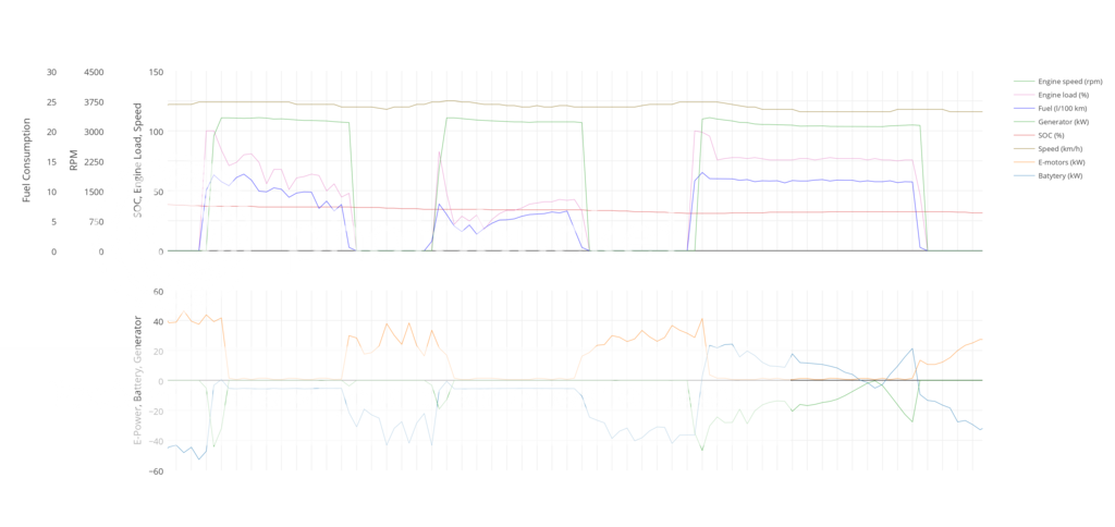
Now do not get me wrong I love these types of graphs to represent data and thank you anko for making it. but I am having trouble telling some of the data colours apart especially in the legend.
It might be the bright white background or just the colours used. I am not sure.
I will bring in one I made a fair while ago.

Now I have no trouble seeing the colours better on this one I made with black background and bright colours although my red numerals up the side of the graph could be brighter.
But I could be biased because I made it to suit my eyes.
Is just me and my crappy eyes? :?
I probably am just too damn old.
Opinions?
Regards Trex.
I am starting to see some great graphs appearing in the Technical discussions.
But I have a confession to make. I am having trouble making out some of the colours used to represent the data.
I will bring in an example supplied by anko.
Now do not get me wrong I love these types of graphs to represent data and thank you anko for making it.
but I am having trouble telling some of the data colours apart especially in the legend. It might be the bright white background or just the colours used. I am not sure.
I will bring in one I made a fair while ago.

Now I have no trouble seeing the colours better on this one I made with black background and bright colours although my red numerals up the side of the graph could be brighter.
But I could be biased because I made it to suit my eyes.
Is just me and my crappy eyes? :?
I probably am just too damn old.
Opinions?
Regards Trex.
